← All work

Case study · Fintech mobile app · Stocks and crypto · 14 weeks

Investing is easy to start. Trusting it is the hard part.

Investment World is a mobile app for buying stocks and crypto, built for people who have never invested before. I designed how they get verified, fund their account and place their first order, without hiding the rules that protect them.

My role
UI/UX designer
Platform
iOSAndroid
Timeline
14 weeks
Scope
Onboarding and KYCFundingTradingAccount
6funding methods, each labelled with its speed
3order types, each explained in context
4costs shown before payment
6agreements, all in one place

01 · The problem

Three walls before the first trade.

New investors face three walls before their first trade: legal onboarding (identity checks and the W-8BEN tax form for non US investors), funding across borders and currencies, and order types full of jargon. Every wall is a place to quit, and every shortcut that hides a rule costs trust later.

  1. Legal onboardingIdentity checks and the W-8BEN tax form for non US investors.
  2. FundingMoving money across borders and currencies.
  3. Order typesMarket, limit and stop-loss, full of jargon.
Core questionHow might we make first time investing feel simple without hiding the rules that protect people?

02 · What we heard

Four themes, four design rules.

We spoke with potential users about existing investment apps. Four themes came back:

What we heardWhat it meansDesign rule
Too complex to understandJargon and dense charts make people feel lostPlain words first, terms on demand
No guidance for beginnersPeople don't know where or how to start safelyTeach inside the action, not in a help center
Cluttered, inconsistent screensHard to track a portfolio or find key numbersOne question per screen, consistent tabs
Low transparency, low trustPeople hesitate when they can't see where money goesShow every fee, rate and timeline before payment

03 · Design decisions

Simple on the surface, honest underneath.

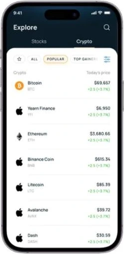
Explore: a Stocks and Crypto toggle with today's price and change on every row
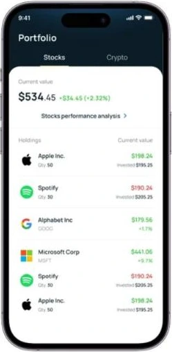
Portfolio: current value with today's change, then holdings with quantity and amount invested
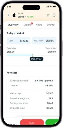
Stock page: today's range on a simple bar before any ratios
1

Explore and portfolio in plain view

Stocks and crypto share one structure: a Stocks/Crypto toggle, today's price and change on every row. The portfolio leads with one number, current value with today's change, then holdings with quantity and amount invested. The stock page puts today's range on a simple bar before any ratios.
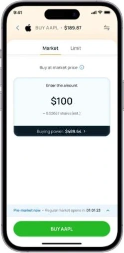
Buy: amount in dollars with the share estimate and buying power underneath
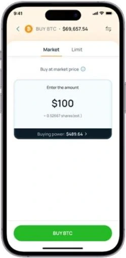
Buy BTC: the same Market and Limit tabs and dollar amount entry as stocks
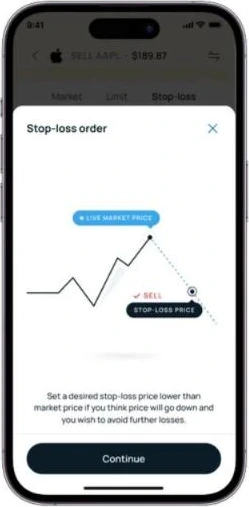
Stop-loss explainer: the live price, the stop price and when the sale triggers
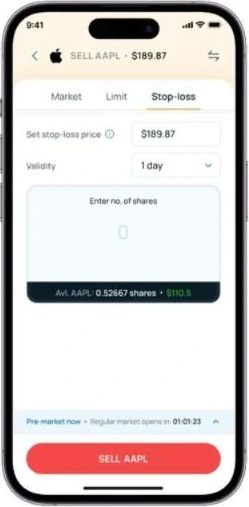
Sell with a stop-loss order
2

Orders explained at the moment of choice

Buying asks for an amount in dollars, not shares, and shows the share estimate and buying power underneath. Three order types sit in tabs: Market, Limit, Stop-loss. The first time someone picks Stop-loss, a one screen visual explains it: the live price, the stop price, and when the sale triggers. Market hours stay visible with a countdown to the open. Buying crypto uses the same tabs and dollar entry, so nothing new has to be learned.

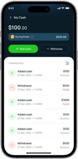
My cash: balance and cash history, with failed transactions marked
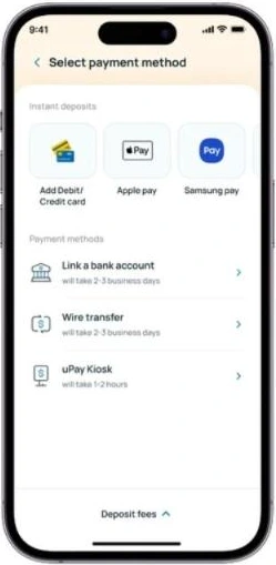
Payment methods, each labelled with its speed
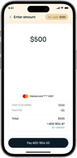
Enter amount by card: $500 plus a $5 fee, total $505, about AED 1854.87
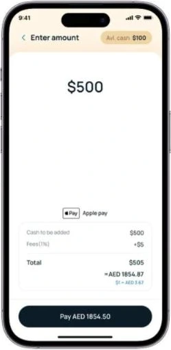
Enter amount with Apple Pay: amount, 1% fee, total and converted local amount
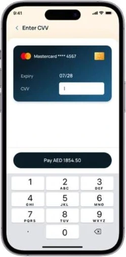
Card CVV confirmation
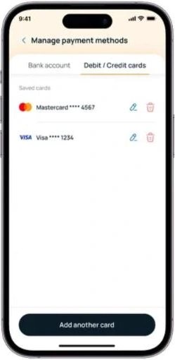
Manage payment methods: saved bank accounts and cards, editable in one place
3

Funding with every cost shown up front

Six ways to add money, each labelled with its speed: card, Apple Pay and Samsung Pay are instant; bank transfer and wire take 2 to 3 business days; a kiosk takes 1 to 2 hours. Before paying, the summary shows the amount, the 1% fee, the total and the converted local amount with its exchange rate (example: $500 + $5 fee = $505 ≈ AED 1854.87). Failed transactions are marked in red in the cash history, so people never wonder where money went. Saved cards and bank accounts can be edited or removed in one place.

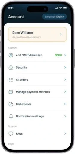
Account: cash, security, orders, payment methods, statements and support in one menu
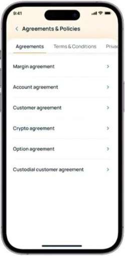
Account: all six agreements in one place
4

Legal steps broken into small, visible pieces

KYC and the W-8BEN form are split into short steps with progress, microcopy and inline tips. Identity checks say up front what's needed (one ID and a selfie) and why ("to check it's really you; photos are encrypted"). All six agreements live in one place in Account, next to cash, security, orders, payment methods and statements.

04 · By the numbers

Counted from the shipped screens.

Design facts from the shipped screens, not usage metrics.

WhatCount
Funding methods, each labelled with its speed6 (3 instant, 3 within 1 hour to 3 days)
Order types, each explained in context3
Costs shown before paymentfee %, total, local amount, exchange rate
Agreements, all in one place6

05 · Expert walkthrough

What I'd fix now.

Rated on Nielsen's severity scale. Expert review of static screens, not a usability test.

ScreenIssueSeverity
Crypto listApple logo used as the icon for Yearn Finance, Binance Coin, Litecoin, Avalanche and Dash3 misleading in a finance app
Enter amountPay button shows AED 1854.50 while the summary says ≈ AED 1854.873 a mismatch on the payment screen erodes trust
Sell stop-lossShare count field shows 0 with no default or hint2
Cash history"Failed" shown only in red text2 colour alone (WCAG 1.4.1)
Explore"Popular" and "Top gainers" sort by excitement, not suitability, for beginners2 worth testing

06 · What I'd test next

Four tasks with 5 first time investors.

Task for 5 first time investorsMeasure
Buy $100 of a stockCompletion, time, do they understand shares vs dollars
Explain what a stop-loss does after the explainerCorrect explanation
Add $500 by cardCan they say the total and fee before paying
Find the account agreementSuccess, taps

07 · Reflection

Trust comes from what you show.

What I learned

  • Trust in fintech comes from what you show, not what you simplify away. Fees, timelines and rules belong on screen.
  • Explaining at the moment of choice beats tutorials nobody reads.
  • Next time I'd test with first time investors before handoff, not after. Issues like the payment total mismatch are cheap to catch on a prototype and costly once shipped.