← All work

Case study · Human Computer Interaction · 2026

12 of 14 students wanted to take part. Something kept stopping them.

Louder is a mobile app that helps international students in Oldenburg find practical and civic events they can actually join, matched to what they need right now and how comfortable they feel with German.

My role
UI/UX design lead
Team
Hamda JavedAhsan LiaqatShanmukh Pilla
Timeline
April to July 2026, one semester
Context
MSc HCI course, Carl von Ossietzky Universität Oldenburg
Methods
SurveyInterviewsAffinity mappingUsability testing
Tools
FigJamFigmaHTML/CSS/JSFigma Make
No German required
Best match: why it fits you
Buddy request accepted
83%task completion in usability testing
83%said they would join an event through Louder
73coded mentions from surveys and interviews
14 + 5survey responses and interviews before any design

01 · Overview

A semester spent on one question: why don't willing students show up?

The problem

International students in Oldenburg take part in local community life far less than local students, even though most of them want to. The barriers are practical, not a lack of interest.

What we did

We surveyed 14 students, ran 5 interviews including the International Office, coded 73 mentions into themes, and traced every requirement back to that data before designing.

What came out

A guest first app with a comfort based language filter, explained event matching, consent based buddies and an impact screen that only shows verified outcomes. 5 of 6 test participants completed every task.

I led the UI/UX design: wireframes, the interactive HTML prototype, the high fidelity Figma prototype, the usability test materials and the poster. Ahsan and Shanmukh led data collection, and the three of us ran the synthesis together.

02 · Problem

Willing, but blocked.

Civic participation, from neighbourhood forums to support sessions and volunteering, is one of the fastest ways to feel at home in a new city. Yet international students in Oldenburg rarely take part.

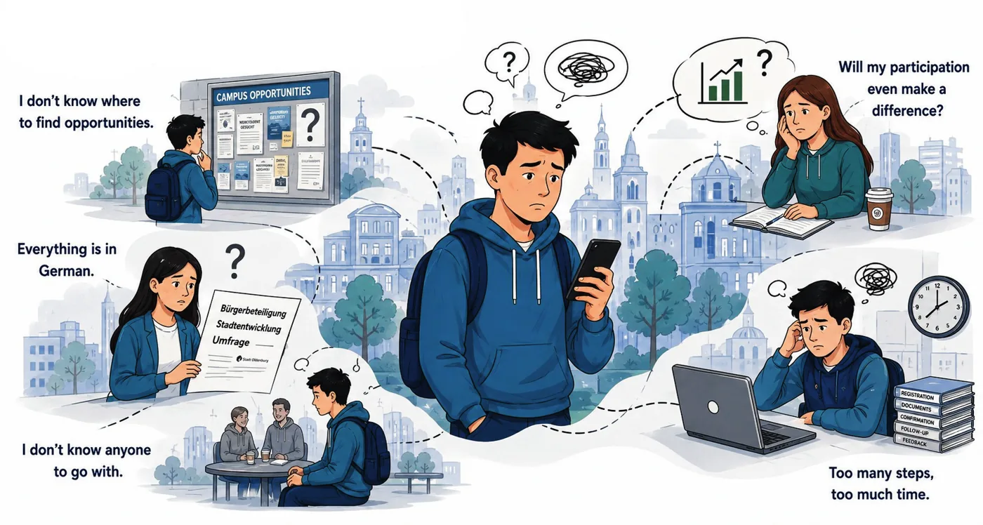
Our survey showed it was not apathy. 12 of 14 respondents said they would participate if opportunities were accessible, relevant and clearly communicated. The desire was there. Four barriers kept getting in the way, and they came straight from what students told us.

Illustration of international students facing four barriers: not knowing where to find opportunities, everything being in German, not knowing anyone to go with, and doubting their participation matters.
Motivation illustration from our project poster, built around the four barriers in our coded data.
AwarenessI don't know where to find opportunities.
LanguageEverything is in German.
Social confidenceI don't know anyone to go with.
TrustWill my participation even make a difference?

03 · Research

Listen first, design second.

14survey responses from international students
5semi structured interviews, including the International Office
1student community (HAGAS) in ongoing conversation
73coded mentions after qualitative analysis
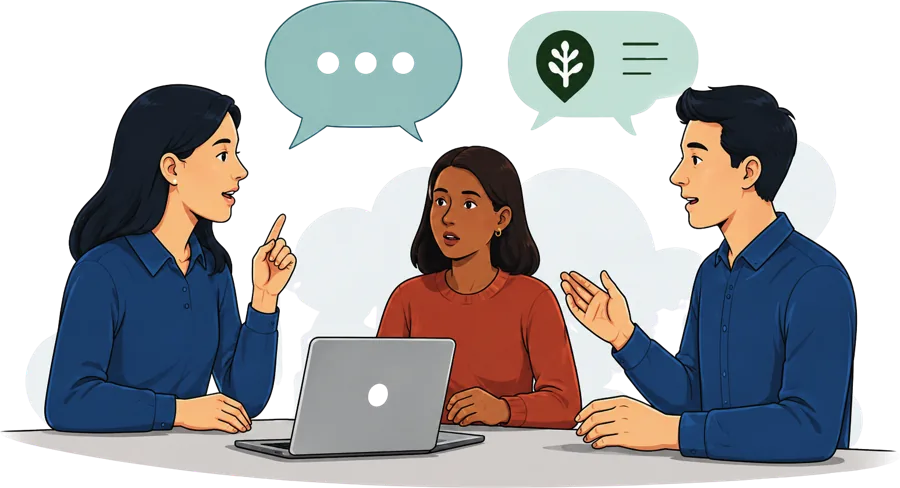
Illustration of a semi structured interview between three people around a laptop.

We combined a short survey for breadth with semi structured interviews for depth. Talking to the International Office mattered: they see the same questions from hundreds of students each semester, so they could tell us which problems repeat.

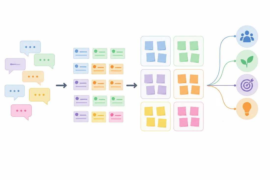
Every open answer was coded, grouped into categories and synthesised into themes through affinity diagramming.

Open responses→Qualitative codes→Categories→Affinity themes→Design opportunities
Diagram of the synthesis process: open responses become coded notes, grouped categories, themes and finally design opportunities.
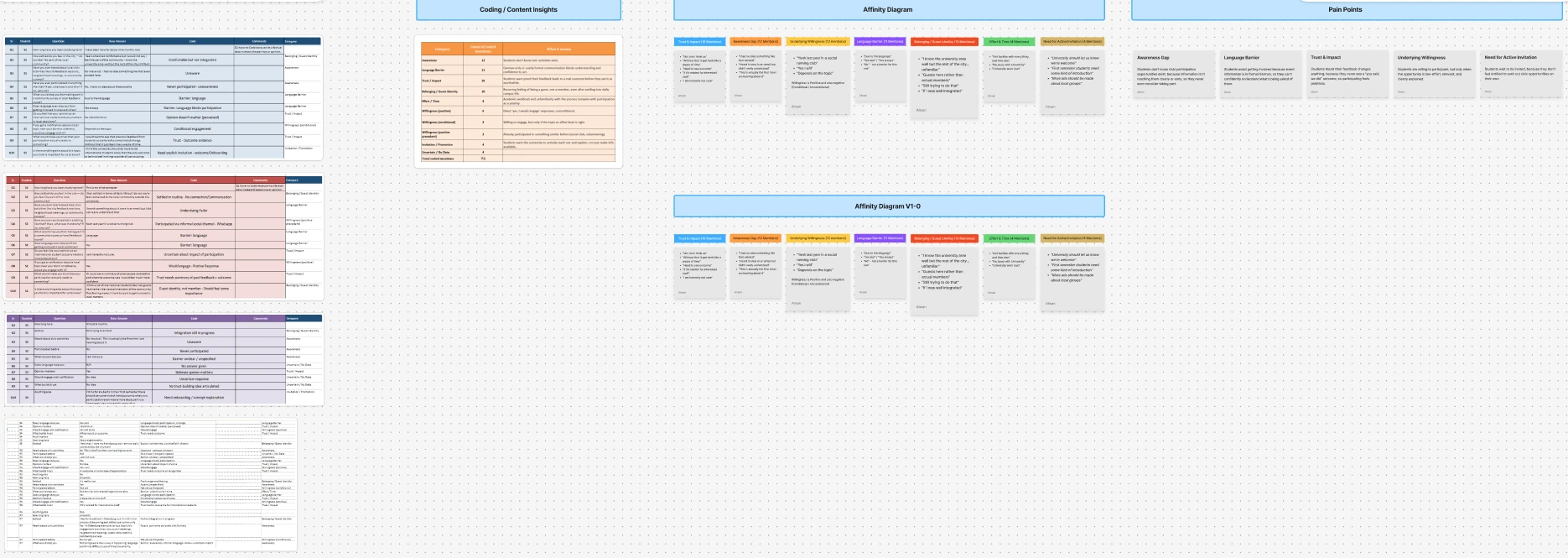
Our supervisor pushed us to keep raw codes visible in the affinity diagram and to use consistent labels. That made the path from a student's sentence to a design decision checkable.
The team's FigJam board: coded survey and interview answers in tables, a content insights table, two rounds of affinity diagram, and the resulting pain points.Open full size ↗
The real board from our analysis in FigJam: every answer coded in tables, counted in content insights, clustered in two rounds of affinity diagram, and turned into pain points.

04 · Insights

The biggest barrier was not language.

We expected language to dominate. It was important, and the International Office called it the most critical factor. But across all coded data, trust came out on top: students doubted their input would lead to anything real.

Coded mentions by theme

n = 73 mentions · 14 surveys · 5 interviews
Trust and impact
16
Awareness
12
Willingness
12
Language
11
Belonging
10
Effort
4
Active invitation
4

“Without that it just feels like a waste of time.”

Survey respondent, on not seeing outcomes · Trust

“I had no idea something like that even existed.”

Survey respondent · Awareness

“Guests here rather than actual members.”

Survey respondent, on how students feel · Belonging

“University should let us know we're welcome.”

Survey respondent · Active invitation
Willingness was conditional.

Students said yes, but “depends on the topic.” That told us relevance had to be visible on every event, not hidden in a filter.

05 · From findings to requirements

Every screen traces back to a sentence a student said.

Barrier foundRequirementWhere it lives in Louder
Trust16Transparent information and visible outcomesImpact screen with organiser verified updates, dated and sourced
Awareness12Easy event discoveryPersonalised feed built from two quick onboarding questions
Language11Language aware participationComfort filter plus a language label on every single event
Belonging10Identity, not only activityJourney screen framed around growing local confidence
Effort4Low barrier onboardingGuest access to every feature, no account needed to join
Invitation4Explicit welcomeWelcome copy that names the barriers and says students belong
Going aloneBuddy participation supportConsent based buddy matching for the same event

06 · Design decisions

Five decisions that carried the design.

Decision 1

Guest first. The account can wait.

“Continue as Guest” is the primary button, and guests get every feature, including registration and buddy matching. The welcome screen names the barriers out loud and offers five languages before asking for anything.

BecauseEffort and belonging came up repeatedly. An account form on screen one tells a newcomer this place is not for them yet.
Decision 2

Comfort, not grades.

Our first version asked for an A1, B1 or C1 level. Students hesitated: it felt like an exam. We replaced it with how comfortable they feel, and the screen says plainly that this is not a test. Every event then carries a clear language label.

BecauseLanguage had 11 mentions, and the International Office named it the most critical factor. The barrier was confidence as much as vocabulary.

Decision 3

Explain every match.

The feed doesn't just rank events. The best match tells students why it was picked: their interests, their schedule and the language support on offer. We also swapped generic city events for the ones newcomers actually need, like residence permit Q&As, housing contracts and CV clinics.

BecauseWillingness was conditional on relevance. Showing the reason makes relevance visible and makes the personalisation trustworthy.

Decision 4

Go together, with consent.

Students can find someone going to the same event. Both people must accept before any messaging opens, and the screen says so before a request is sent.

Because“I don't know anyone to go with” was one of the four barriers. Safety and privacy had to be visible, not buried in settings.

Decision 5

No invented impact.

The Impact screen separates what a student gained from what organisers report. Organiser outcomes only appear once verified, with a date and a source. Until then, the screen says it is waiting.

BecauseTrust was the largest theme with 16 mentions. Fake progress numbers would have repeated the exact problem students described.

07 · Iterations

Three prototypes, each answering a different question.

Stage 1 · Figma

Low fidelity wireframes

Does the structure make sense? We mapped the flow from welcome to impact and checked it against every requirement.

Stage 2 · HTML/CSS/JS

Interactive prototype

Does the flow feel right in the hand? A clickable build let us test real transitions and timing before polishing visuals.

Stage 3 · Figma Make

High fidelity prototype

Is it ready for testing? The final version ran on participants' phones in the usability study.

Generic city events, like cleanups→Events newcomers need: permits, housing, jobs
A1, B1, C1 language grades→Comfort based language filter
Journey as an activity tracker→Journey framed as growing local confidence
Impact shown as big statistics→Verified organiser outcomes with date and source
Account required at the end→Gentle guest to account prompt after a first event

08 · Evaluation

Tested with the people it was built for.

We ran a within subjects usability study with 6 international students. Each completed four tasks across the core flow, then answered questions about usability and whether they would actually participate.

Task completion5 of 6 participants finished every task.

Participation intention5 of 6 said they would join an event through Louder.

ParticipantsInternational students in Oldenburg. A small sample, so we read results as direction, not proof.

What worked

  • The German comfort system. Participants understood it instantly and felt it was respectful.
  • Privacy transparency in the buddy flow made people willing to try it.
  • The Impact screen. Seeing verified outcomes made participation feel worth it.

What we fixed

  • Buddy flow clarity: states for sent, accepted and declined were made explicit.
  • Post check in: added a clear next step after attending an event.
  • Guest to account: the upgrade prompt now appears only after a first completed event.

09 · Reflection

Design for confidence, not just access.

The most useful thing this project taught me: the loudest barrier in a brief is not always the biggest one. Language was the obvious problem. Trust was the real one, and only the coded data showed it.

If I continued Louder, I would test with a larger group over several weeks to see whether participation actually rises, not just intention. I would also work with real organisers on the verified updates, since the whole trust model depends on them publishing outcomes, and run a full accessibility audit across all five languages.

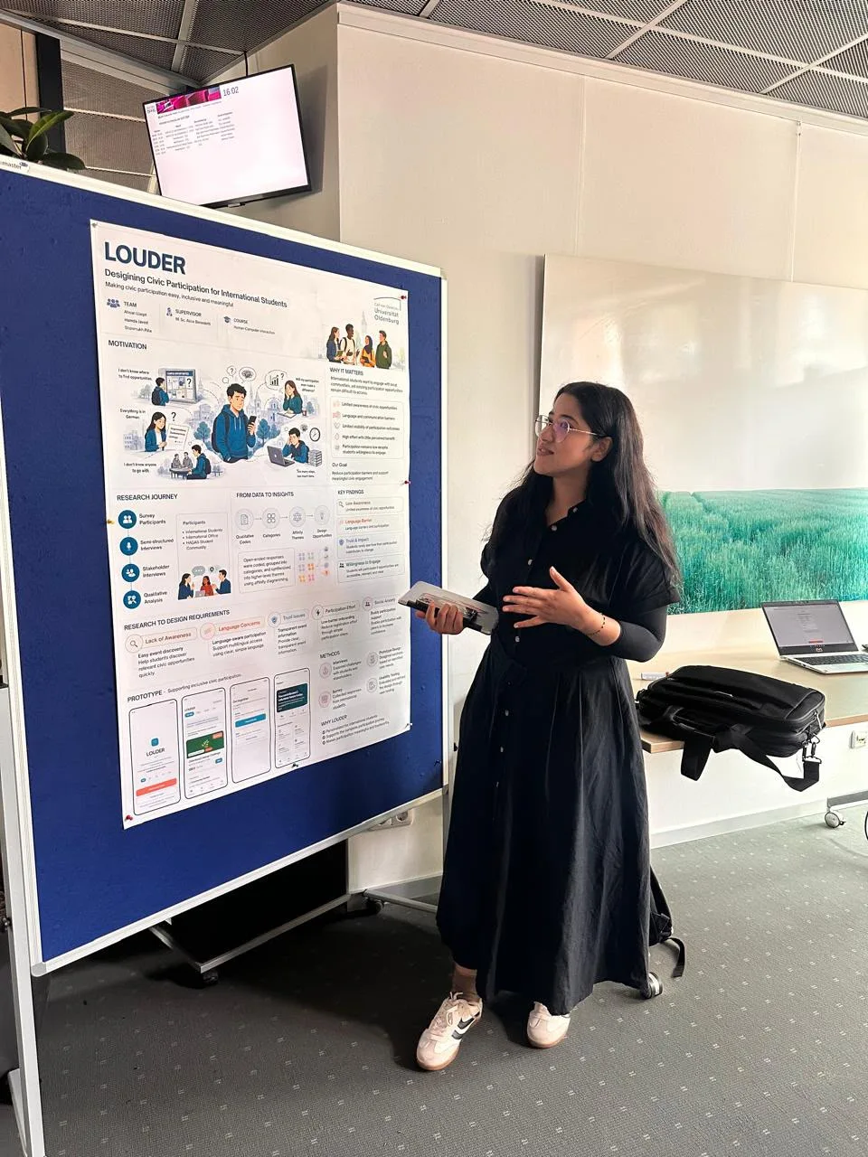
Hamda presenting the Louder research poster at the university poster session.
Presenting Louder at the HCI poster session, Carl von Ossietzky Universität Oldenburg, July 2026.